


Branding
Café de Spécialité
A brand built for the best beans.
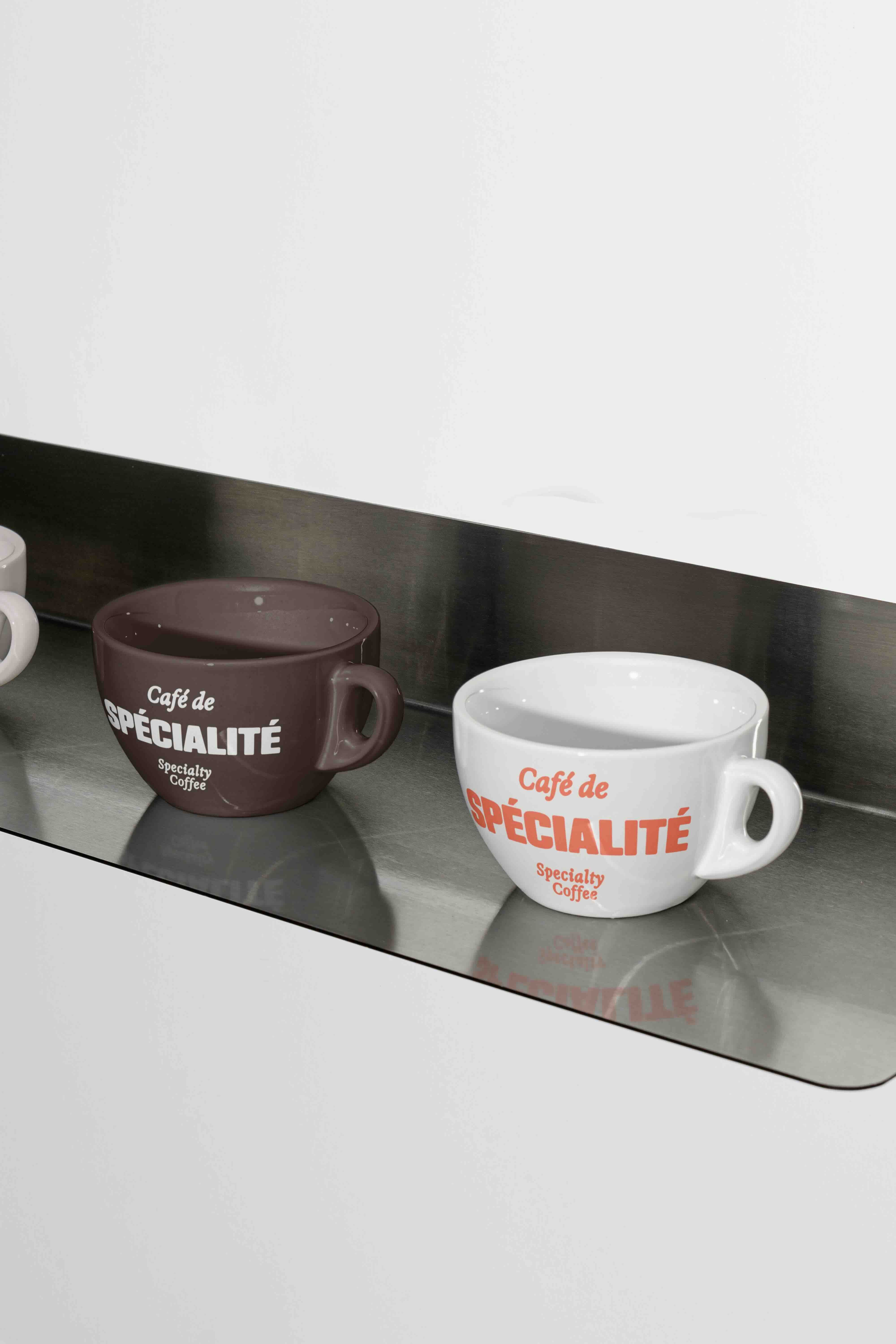
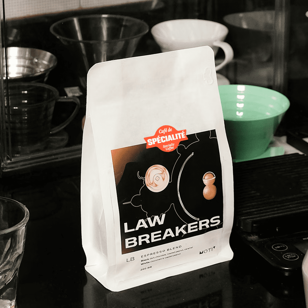
The Brief
When La Nouvelle Vague approached our brand identity design studio, they had a vision and no visual language to express it. As a specialty coffee certification body entering a discerning, competitive market, they needed more than a logo; they needed a complete brand identity system built to function as a professional certification mark. Our scope as their branding agency covered the full foundational mandate: brand naming, logo design, colour palette development, and typography selection. Four disciplines. One cohesive identity.
The work
Brand naming
Naming a certification body requires precision. The name must carry authority, be memorable across languages, and signal the category instantly. We developed Café de Spécialité to position the certification at the intersection of French culinary tradition and the global specialty coffee movement, a name that communicates expertise without sacrificing warmth.
Logo design
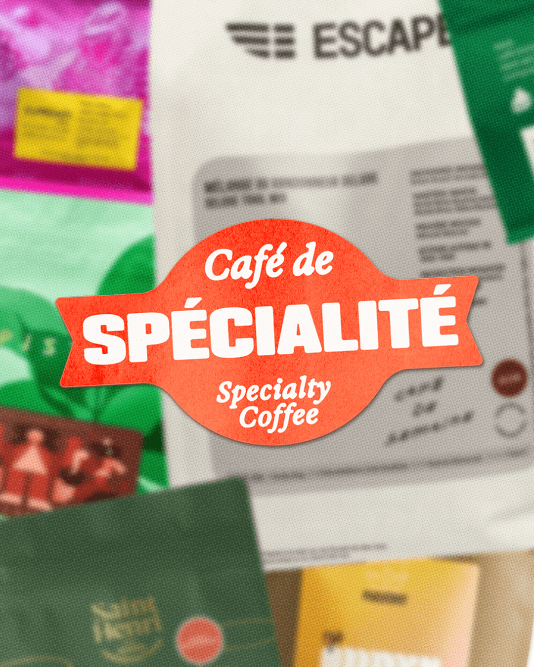
For food and beverage brands, the logo is the certification mark. It has to work at every scale, embossed on a certificate, printed on packaging, rendered as a favicon. Our logo design process for Café de Spécialité produced a mark that is immediately legible, category-distinct, and built for longevity, not trend cycles.
Brand colour palette
Colour in food and beverage branding does more than differentiate, it communicates sensory experience before a single word is read. We developed a palette drawn from the terroir and craft of specialty coffee: deep, considered tones that hold their integrity across premium print, packaging, and digital environments.
Typography system
A professional certification demands typographic credibility. We selected a primary typeface with classical structure and quiet authority, paired with a functional secondary typeface for body copy, documentation, and digital use, giving the brand system range without sacrificing cohesion.
The result
Café de Spécialité launched with a brand identity system that does exactly what great food and beverage branding should: it communicates trust and expertise at a glance, scales across every touchpoint, and positions the certification as a mark that professionals in the specialty coffee industry are proud to pursue and display.
For our branding agency, this project is a strong example of what we do best, building visual identity systems for food and beverage brands that need to earn credibility fast and hold it long-term. If you’re a coffee brand, a hospitality concept, a specialty food producer, or an F&B certification body looking for a branding partner, this is the kind of work we bring to every engagement.
Brand naming: developed the name Café de Spécialité
Logo design: created a primary certification mark
Colour palette: selected and defined the brand colour system
Typography: chose and paired primary and secondary typefaces
Brand guidelines: documented rules for consistent application
Next up
CHARLY & CO.
CHARLY & CO. combines refined service and strategies with an industry-leading experience.