


Branding
Twist
Repurposing textiles to make the fabrics of tomorrow.

As part of our work as a marketing agency, we built the branding for Twist, a textile upcycling technology.
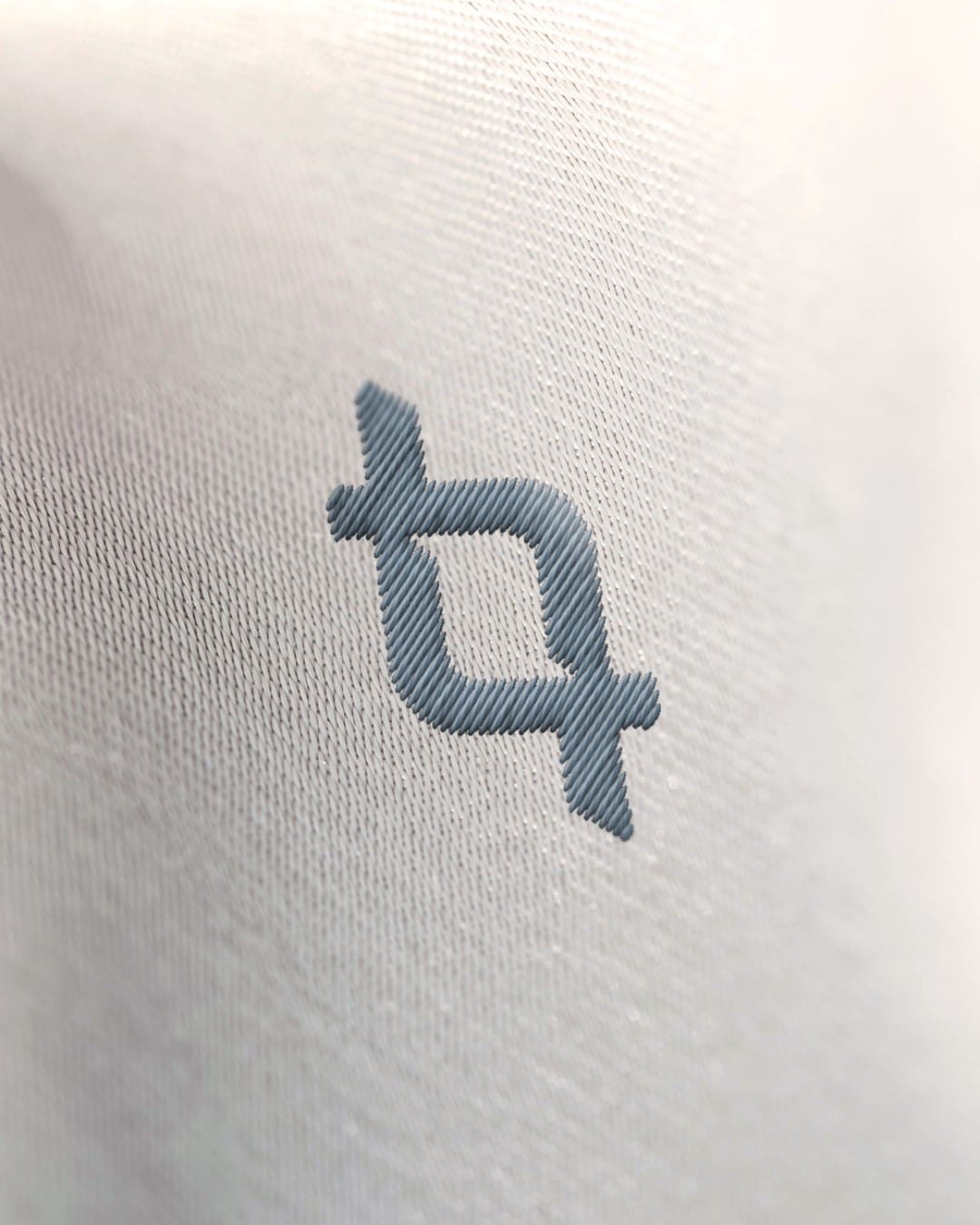
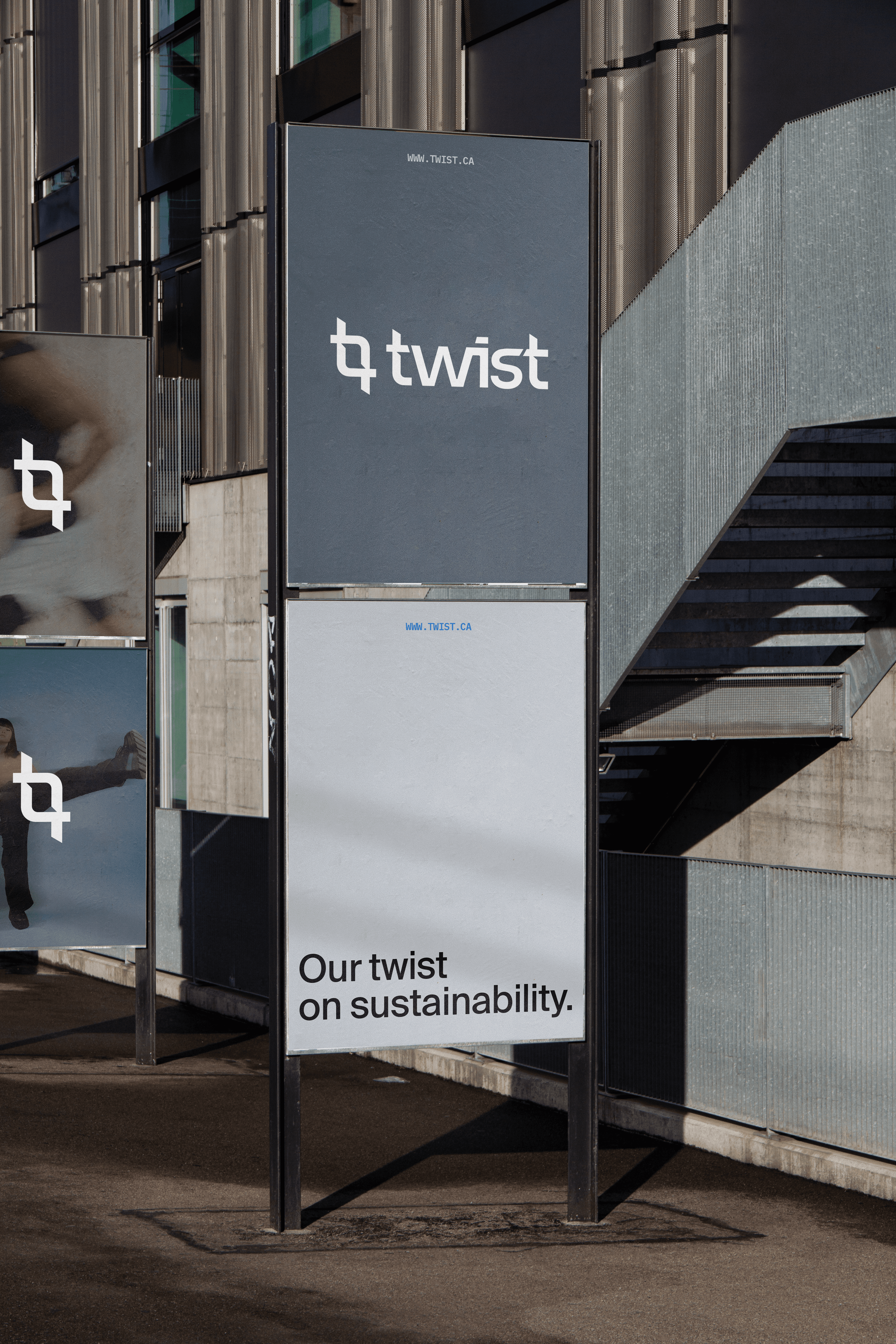
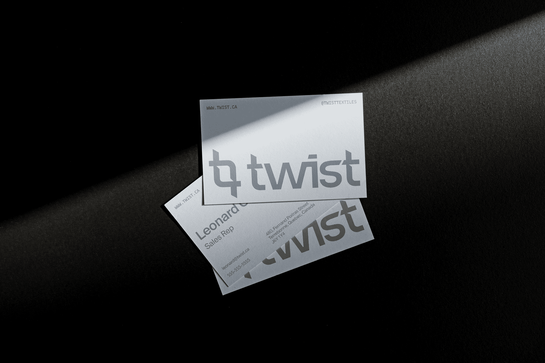
For Twist, we developed a visual identity combining innovation and textile sensibility. To achieve this, the logotype was designed to evoke a technological essence, thanks to a refined, angular typography. Subtle curves recall the textile thread, notably through the link between the “s” and the “t”. The logo icon features the two “T ”s of the Twist name, intertwined to create a visual motif evoking two woven threads, in line with the circular transformation process at the heart of Twist’s mission.
The chromatic palette is based on sober shades of grey, chosen to give way to the varied textures and colors of the textiles in the visuals. An accent of blue completes the ensemble, in a nod to Loop Industries, the project’s parent company.
As for typography, we opted for a simple duo: a clear, legible main font, accompanied by a more technical secondary font, emphasizing the innovative nature of the technology.
Finally, imagery plays a central role in the brand universe, featuring movement and textiles to illustrate the dynamic cycle of reuse made possible by Twist.
To find out more about our branding work, click here.
Brand Identity
Logo Design
Graphic Design
Name Research
Font Selection
Complete Brand Guide
Next up
TWM Group
TWM Group is a team of independent minded professionals, focused on Total Wealth Management.